Laura Ashley x Freckleface
Freckleface, known locally and nationally for their ethically produced luxury home fragrances, approached us to support the launch of an exciting new collaboration with iconic British brand Laura Ashley.
The two family-founded businesses began from their respective kitchen tables. They have come together to launch a trio of fragrances evoking their unique stories and capturing the essence of nature.
We were tasked with bringing Freckleface’s vision for the range to life, from the initial fragrance stories to a product photoshoot and style guide to be used across all channels for the collaboration launch.
Morning from the potting shed
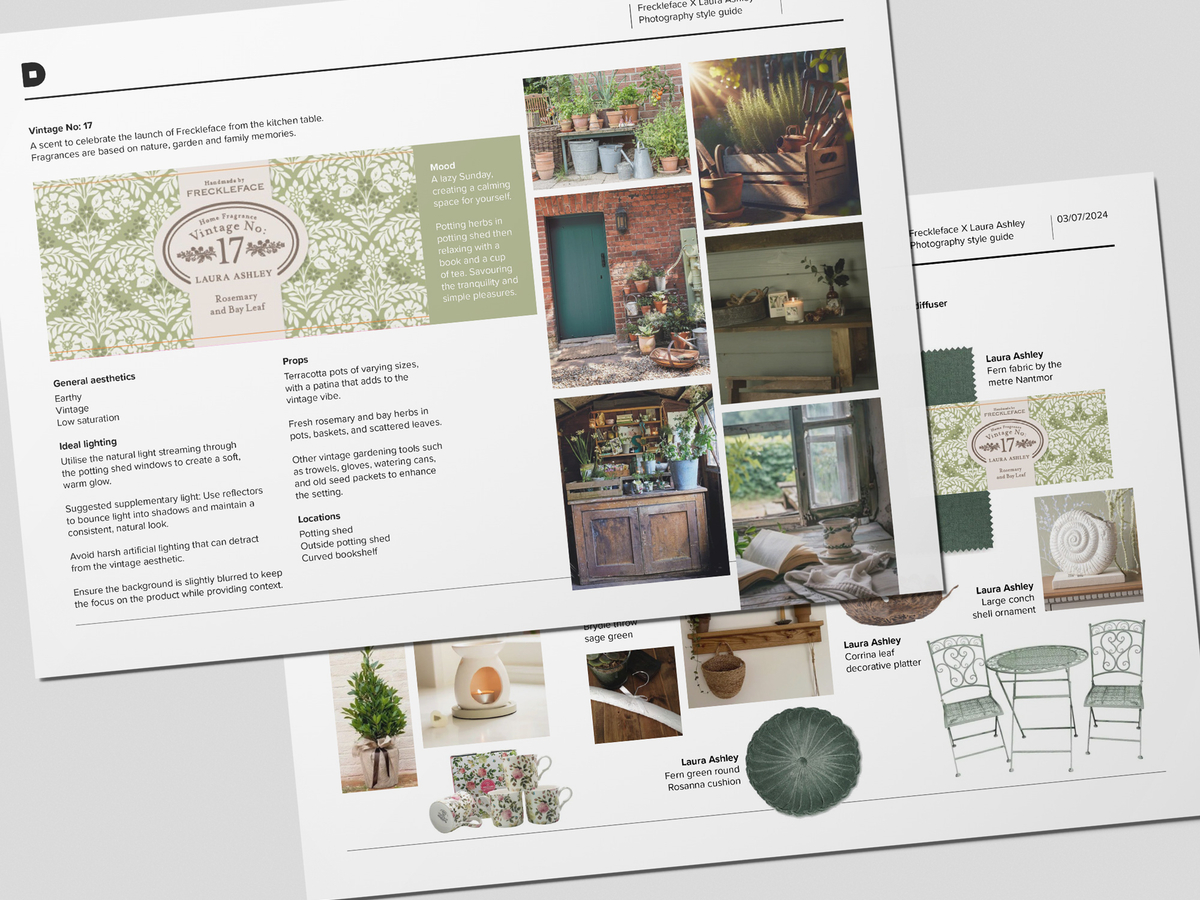
Working from Freckleface’s inspiration board and scent description provided for each fragrance, our creative and content teams started planning a photography style guide with stories to evoke each scent visually.
Ahead of the 3-day photoshoot and with tight launch deadlines, we needed to gain approval on the visual direction from the Laura Ashley and Freckleface teams. We started by creating an overall mood for each fragrance and selecting complimentary props from the two brands and settings within the shoot location, the home of Freckleface's founder, Tara. We wanted to capture a mood that would resonate with the two brand's customers while evoking a sense of nostalgia.

Vintage No. 53 – celebrating the launch of Laura Ashley in 1953
A warm summer day in the garden, picking wildflowers and getting ready to host.
Vintage No. 17 – celebrating the launch of Freckleface in 2017
A calm Sunday morning, creating space for yourself in the potting shed.
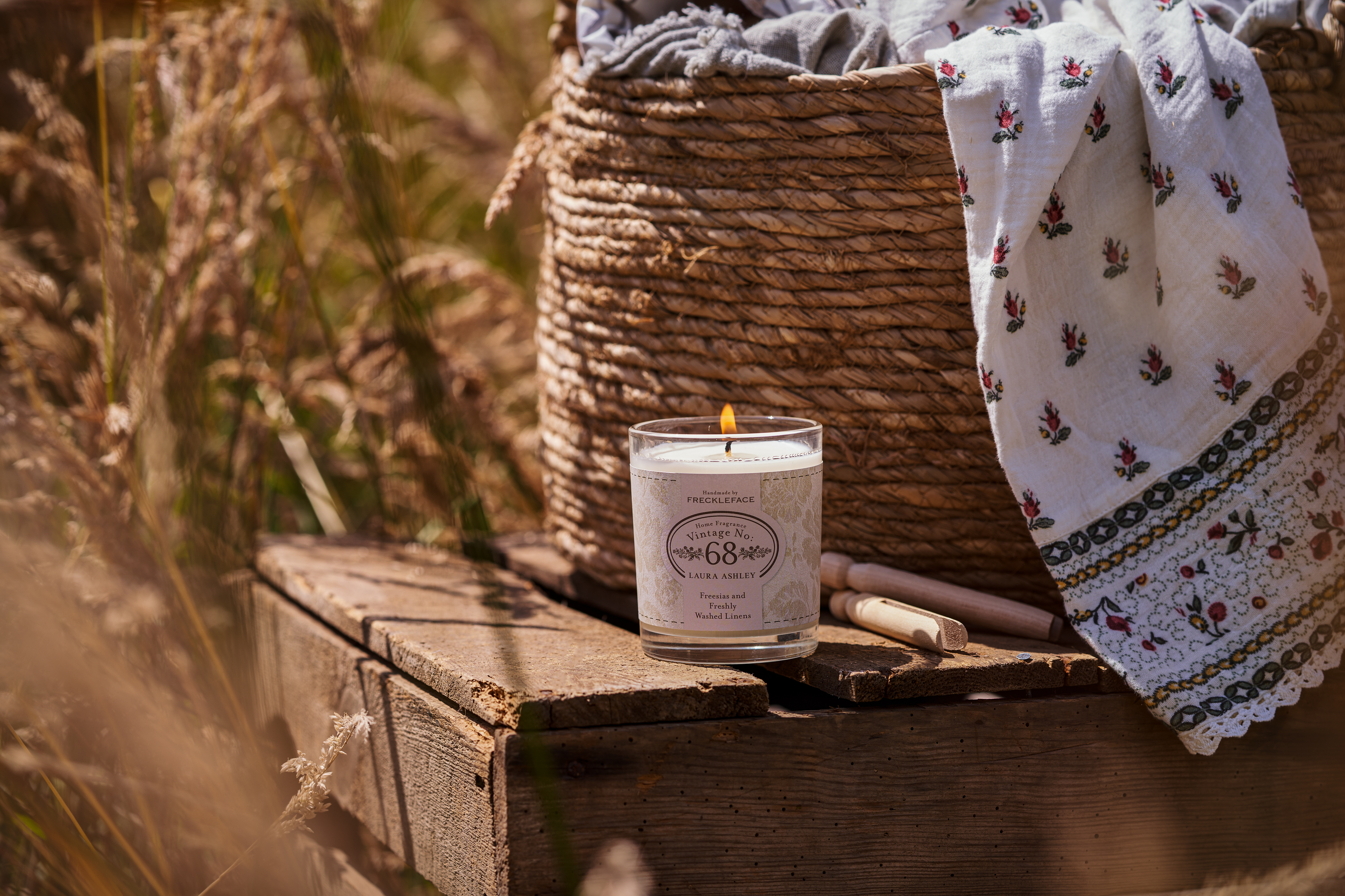
Vintage No. 68 – celebrating the launch of the first Laura Ashley store in 1968
Unwinding on a summer day, slower pace, and letting go of routines.
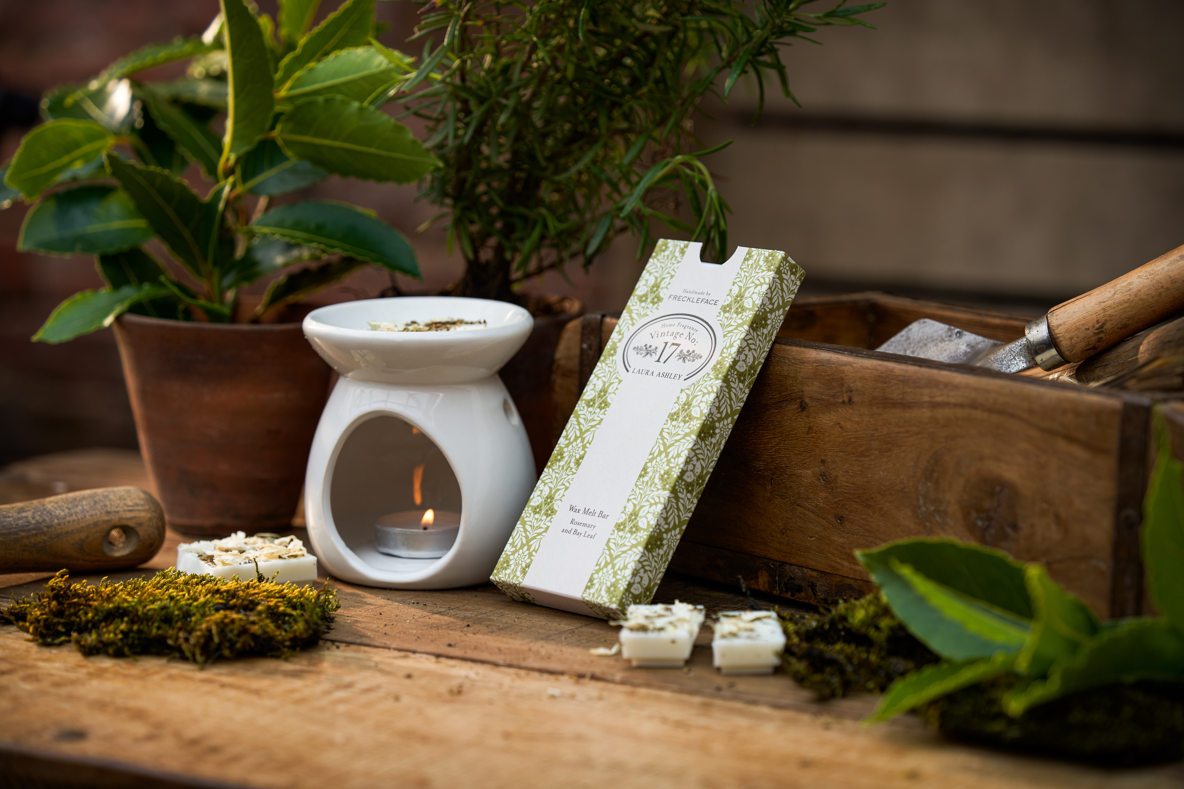
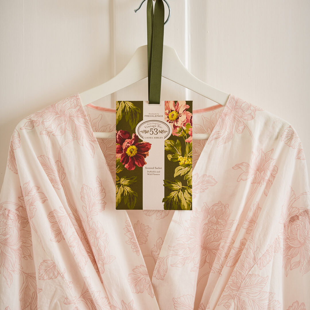
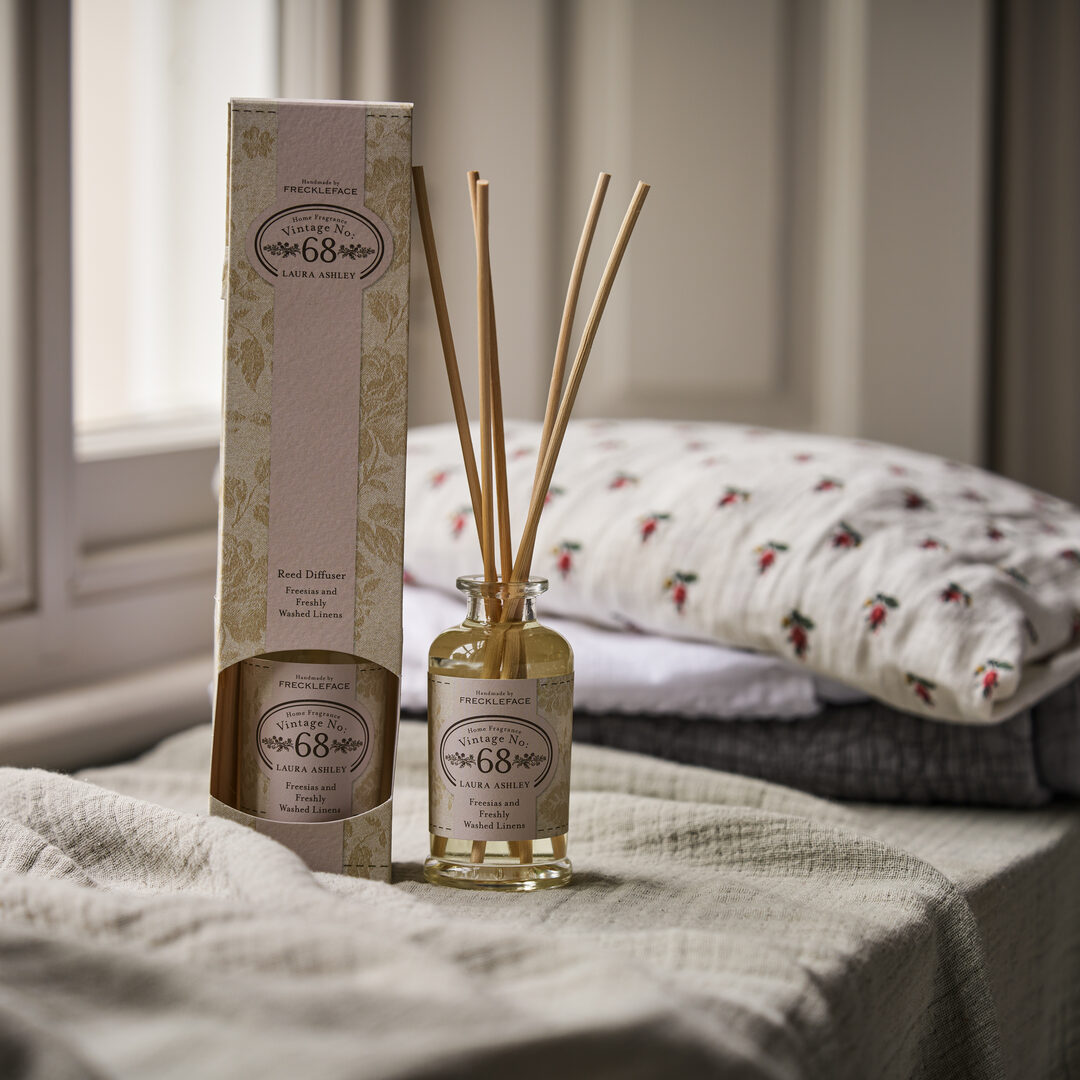
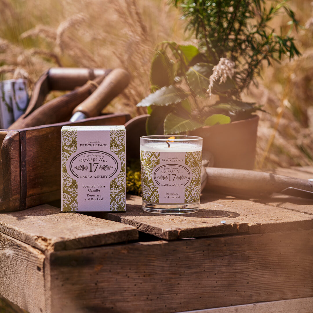
Bringing the scents to life
After recommending a lifestyle photographer, we organised a schedule to cover all the products in the range and how these would fit within each fragrance story, including props to complement each. Dsquared Senior Creative Designer Karis supported the shoot to ensure each set-up followed the style guide and authentically followed the story for each fragrance. Karis’s commitment to style even saw her scraping moss from a roof with a spatula!
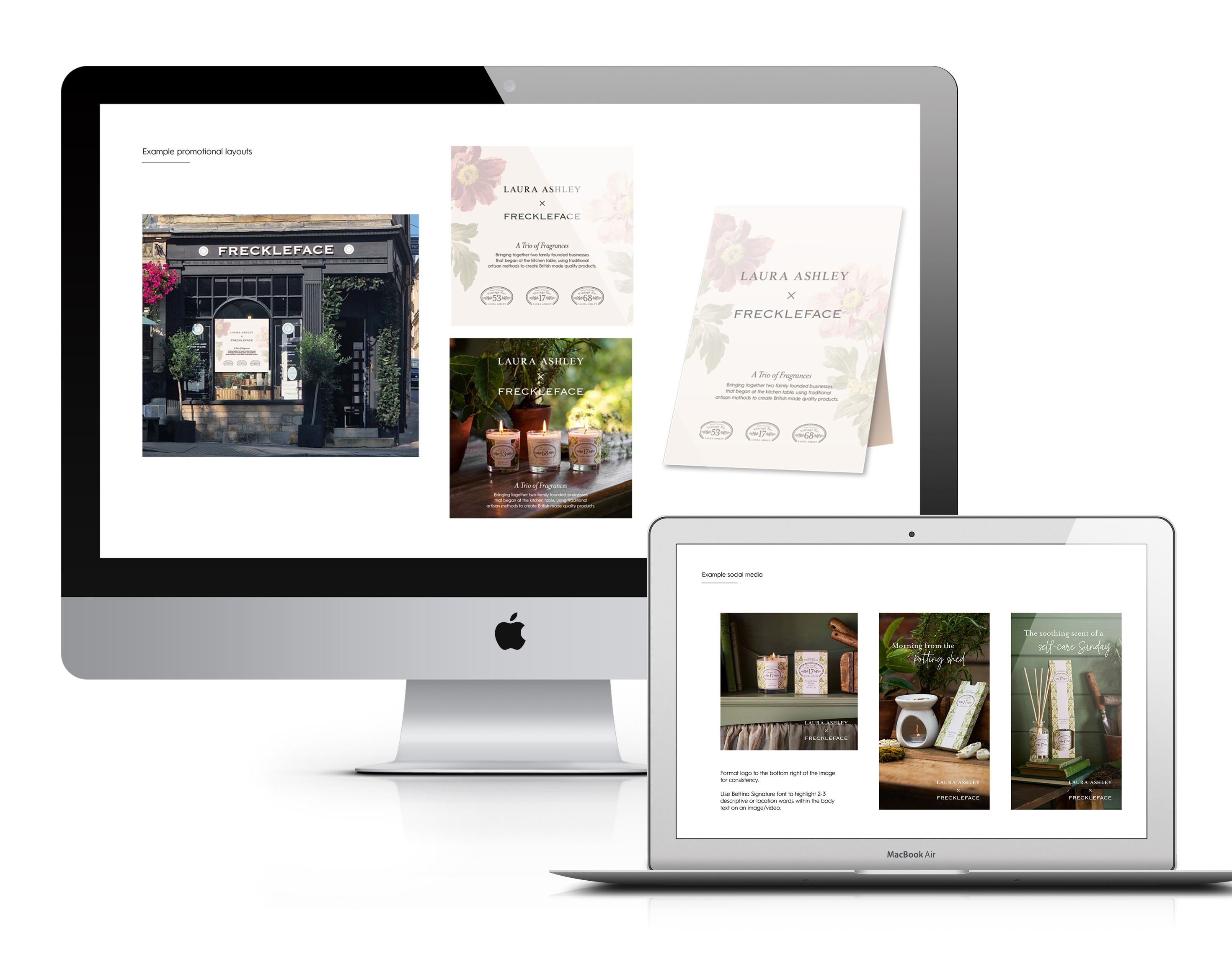
With the product photography signed off, we set to work on the collaboration style guide to be used by both brands across all launch channels. This guide included collaboration logo usage, fonts, colours, and how to use the imagery across various channels with headline content examples. The style guide would ensure consistency, providing maximum impact for the range throughout the launch.
