Lincolnshire Chamber of Commerce
The Lincolnshire Chamber of Commerce invited us to revitalise their brand, to broaden their appeal to both potential and existing members, and create a stand-out theme across all marketing channels.
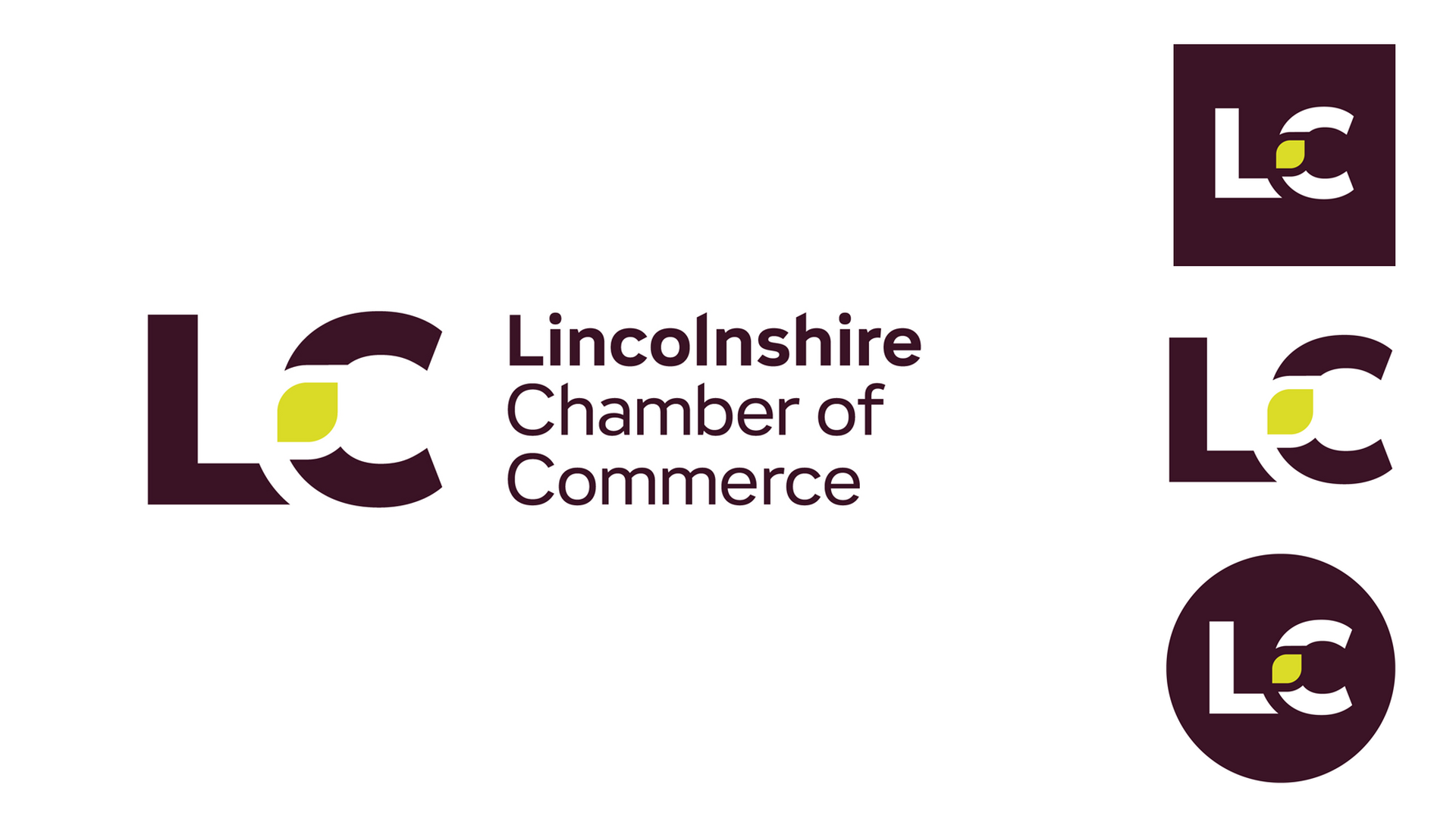
The brand identity is underpinned by the theme WHERE BUSINESS LINCS, inspiring both the linking of the LC logo marque and the connection to the county. The messaging extends to the services provided.
Our challenge was to create a brand identity that matches a strong forward-thinking ethos, while honouring their heritage and 130 years of supporting businesses.
Moving away from the typical colours associated with networking we developed an eye-catching palette to achieve this. Providing each division of the business with ‘pop off the screen’ secondary colours.
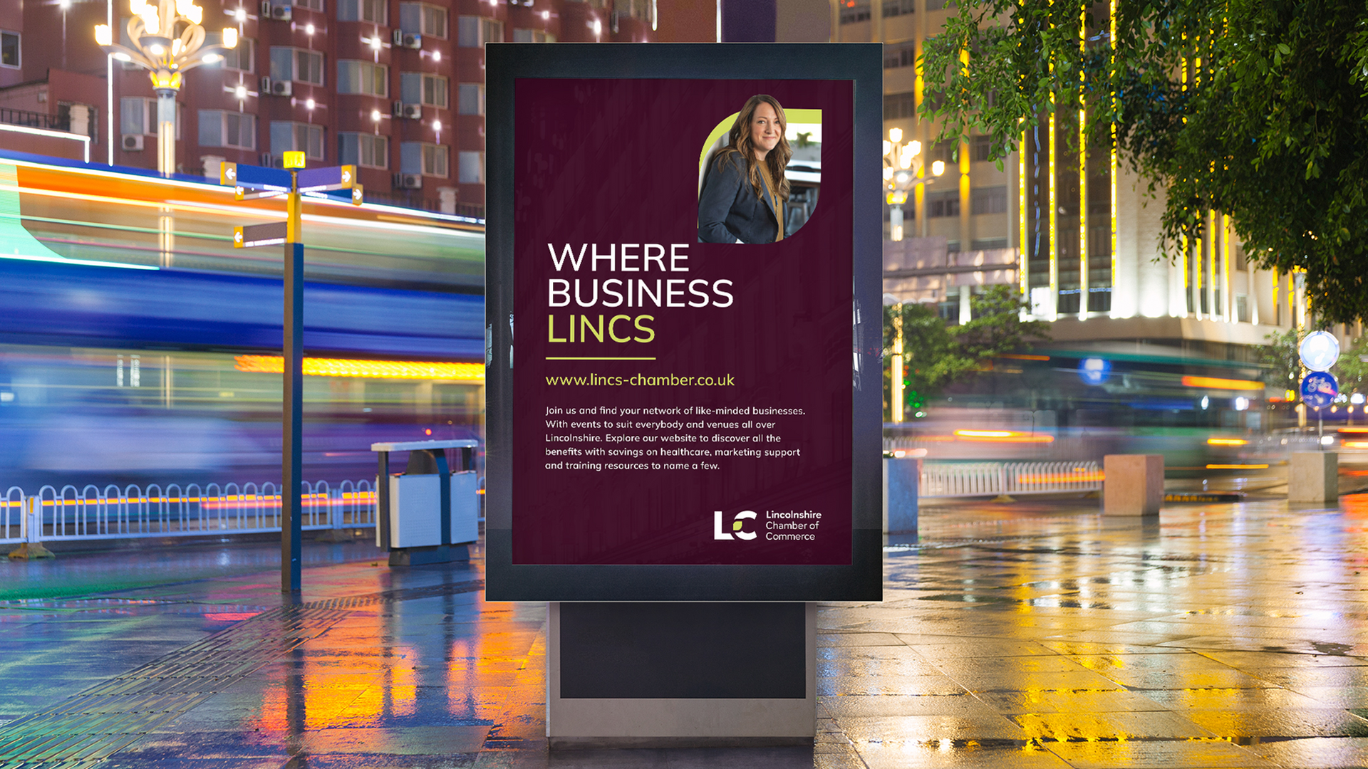
We worked closely with LC’s Head of Marketing throughout the process from the initial surveys, research and analysis, through to the internal brand reveal, and then the external launch.
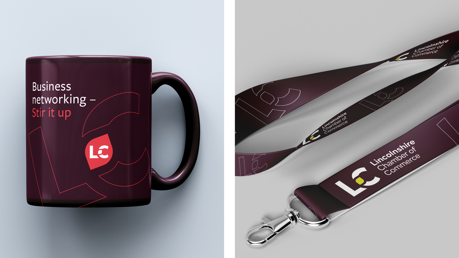
The in-house launch was supported with a taste of the marketing materials that will help to communicate LC’s offering.
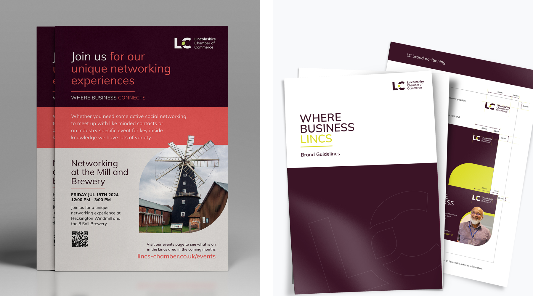
The final result is a versatile identity that stands out from the crowd, and a logo marque that is effective across all media channels.
Promotional marketing has been created in line with the new identity alongside the guidelines, allowing the LC team to create promotional material with ease and on brand.
