Hegarty
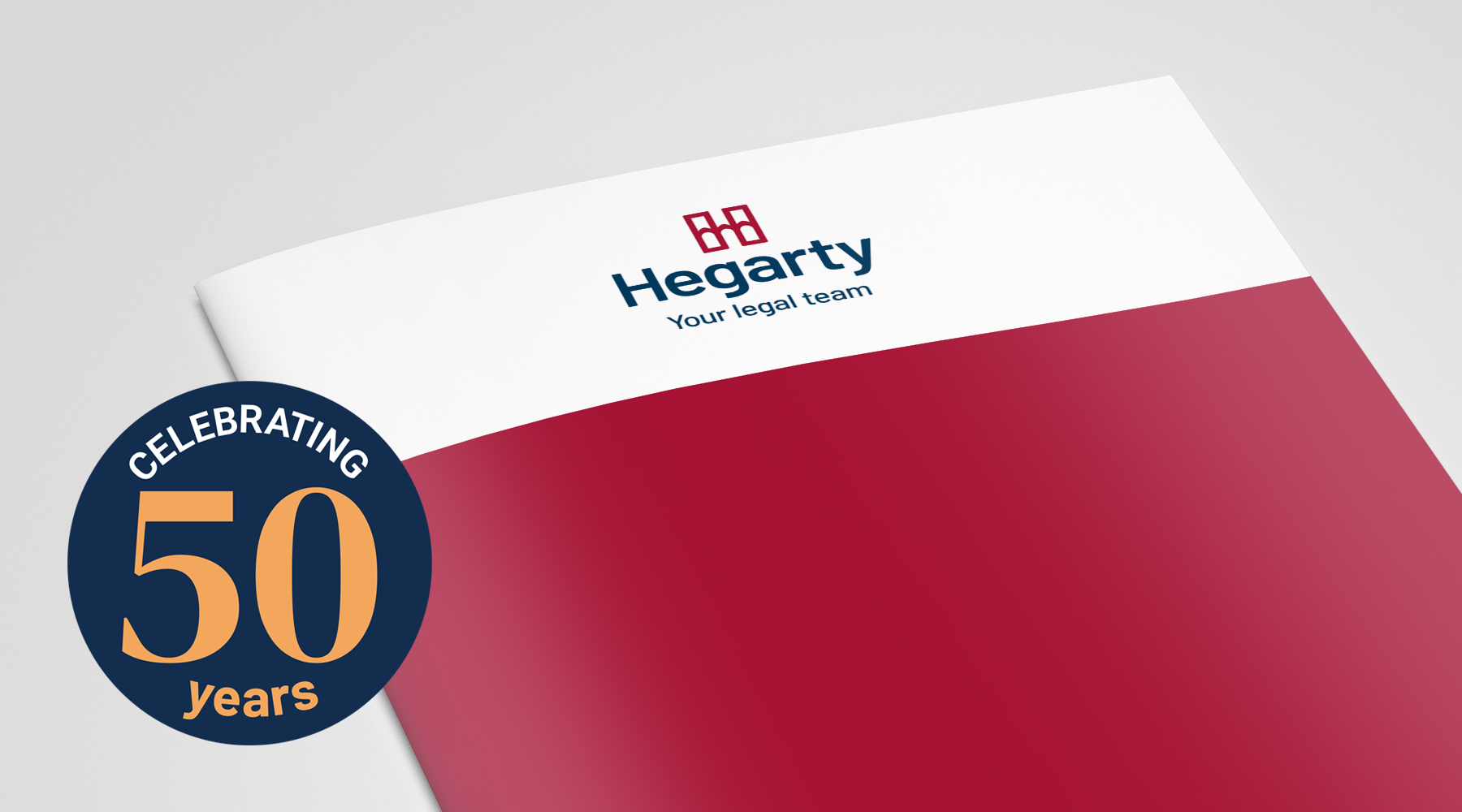
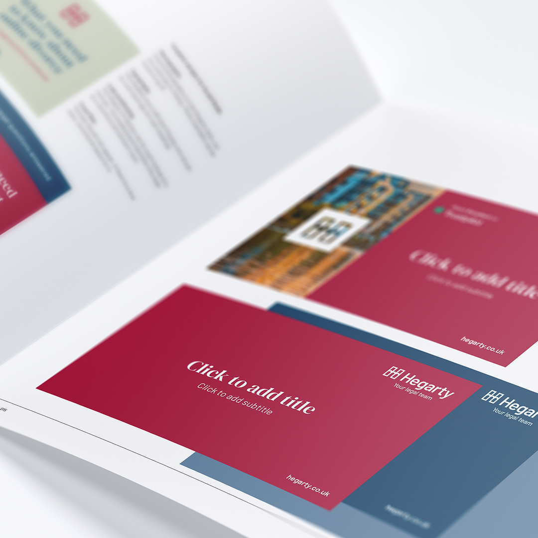
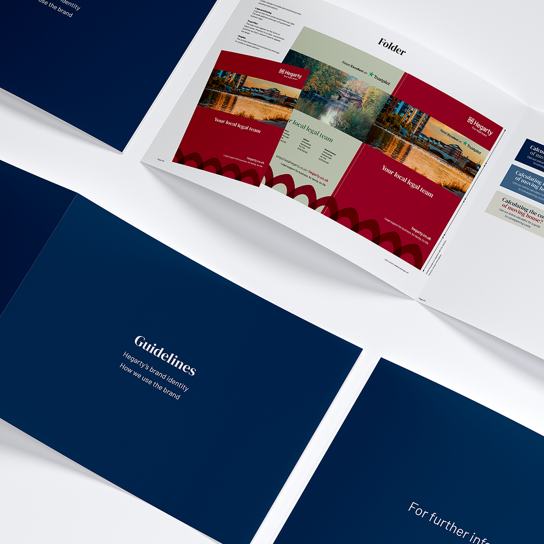
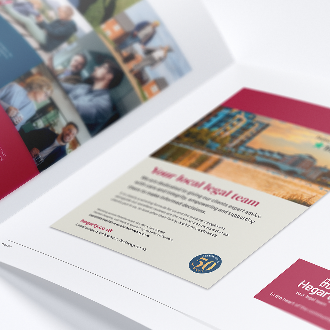
We've joined in with the 50th anniversary celebrations and created a brand refresh for local law company, Hegarty.
A significant evolution of their existing brand was required to reflect their values and illustrate their unique position in the marketplace. This brand identity needed to visually deliver change but with some familiarity to ensure we have the support of their loyal audiences. Together with a new website, we were able to portray their professionalism with a human touch.
Think Hegarty!
It was clear from all the evidence gathered that Hegarty has a loyal customer base with 93% of clients either ‘highly likely’ or ‘likely’ to recommend them and consistently refered to as ‘approachable’, ‘trustworthy’, ‘professional’ and ‘reliable’.
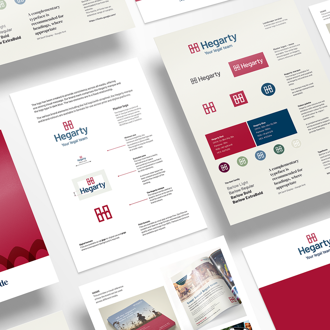
Drawing upon our research, and combined with the surveys that targeted Hegarty’s team and their customers we were able to begin the journey of strengthening their vision, mission and values. By solidifying these foundations we had the ingredients to then revitalise their brand identity in alignment.
Building the brand
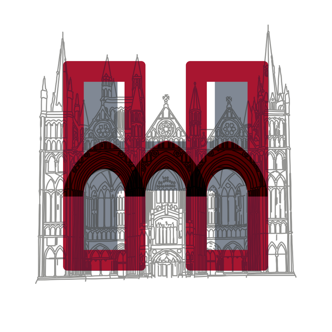
Unique to Hegarty is their desire to serve and embed themselves in their local communities, providing a ‘go to’ legal service for families and businesses alike. With this in mind we wanted to create an icon that was familiar and personal to a local demographic. Peterborough Cathedral is without doubt the ‘stand out’ focal point and we were drawn to the striking gothic arches that also gave a nod to the bridges in the market towns of the local Hegarty offices. Combined with a strong ‘H’ we created their marque which reflects connection and their values, while addressing any practical challenges when reproduced across different platforms.
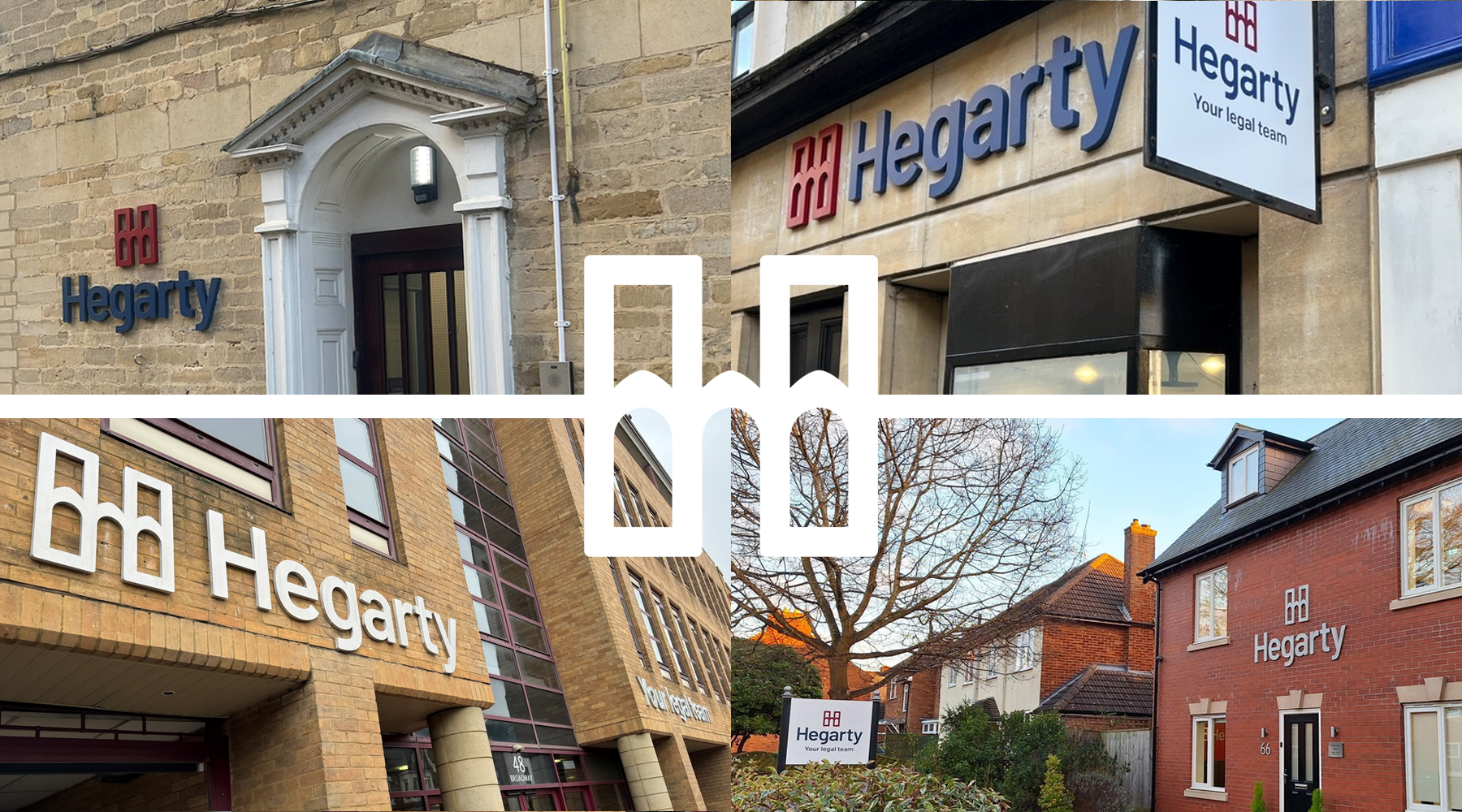
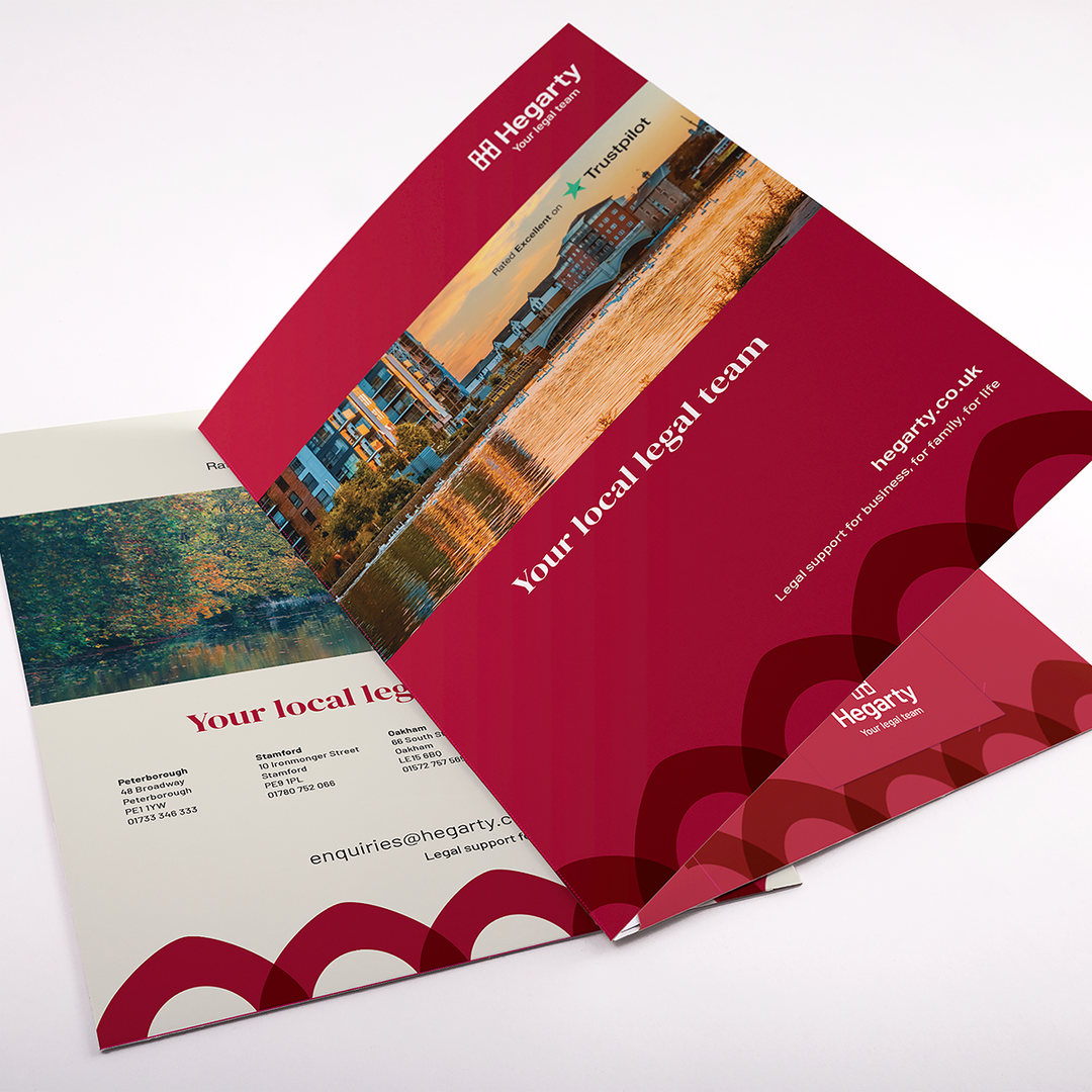
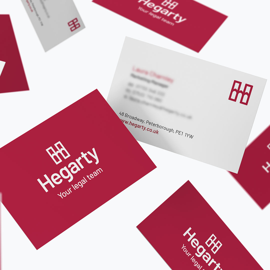
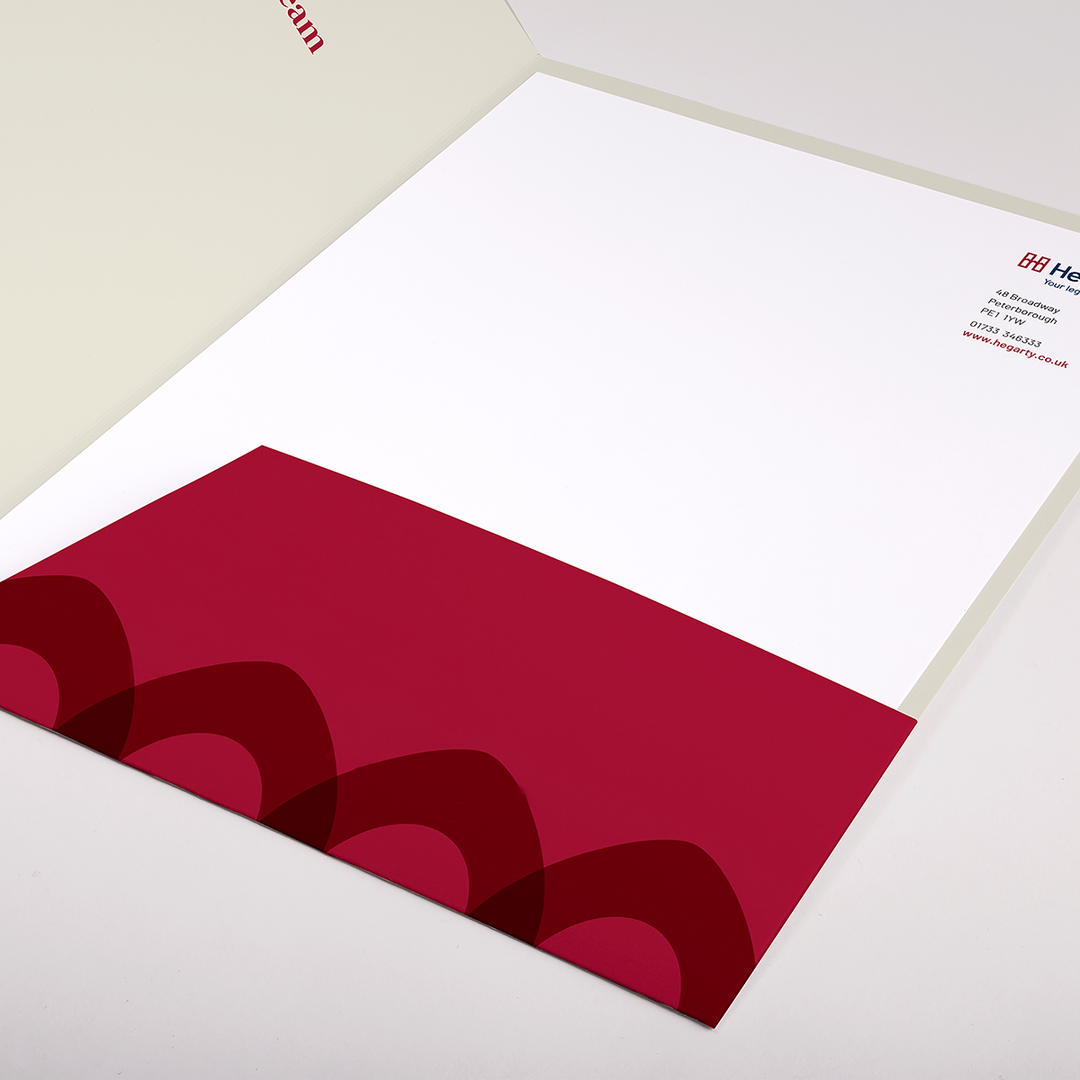
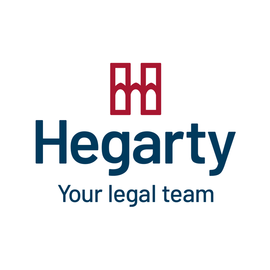
To build upon their values further we moved to a more confident strapline ‘Your Legal Team’ to ensure the focus is always on the customer.
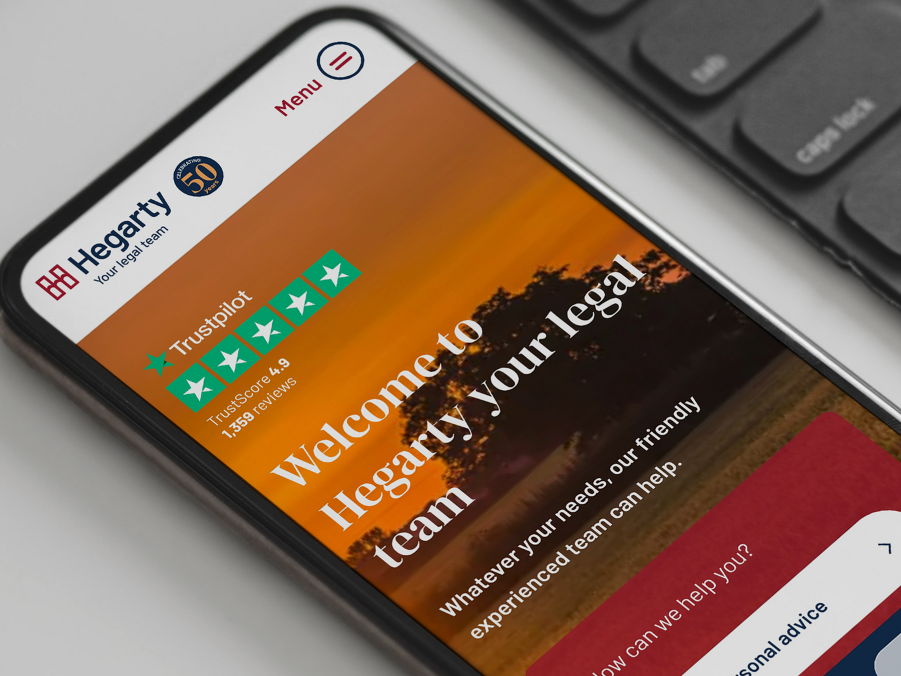
Digital impact
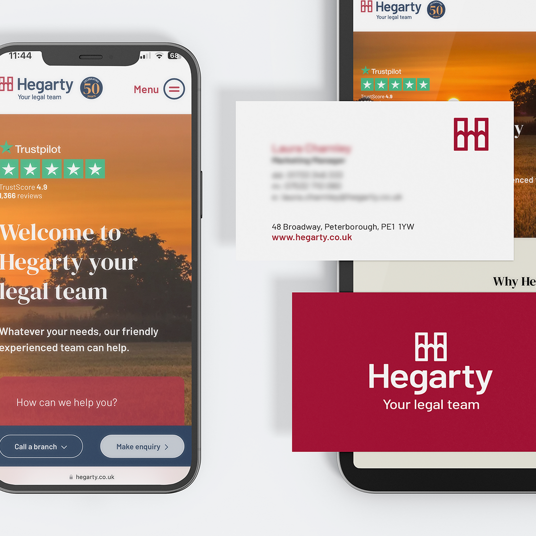
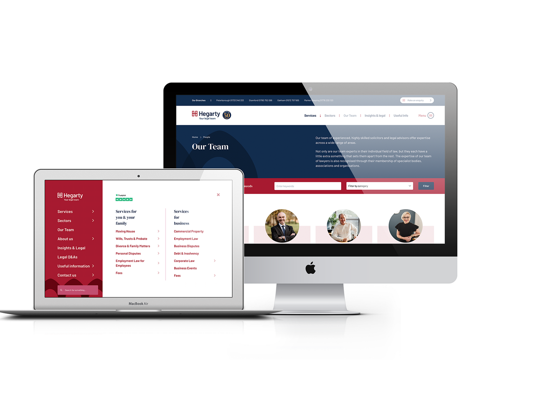
To further elevate their presence and support the new brand identity we embarked on rebuilding their website. With great content already in place the site was rebuilt to maintain their strong google positioning, reflect their values and connection to the local community.
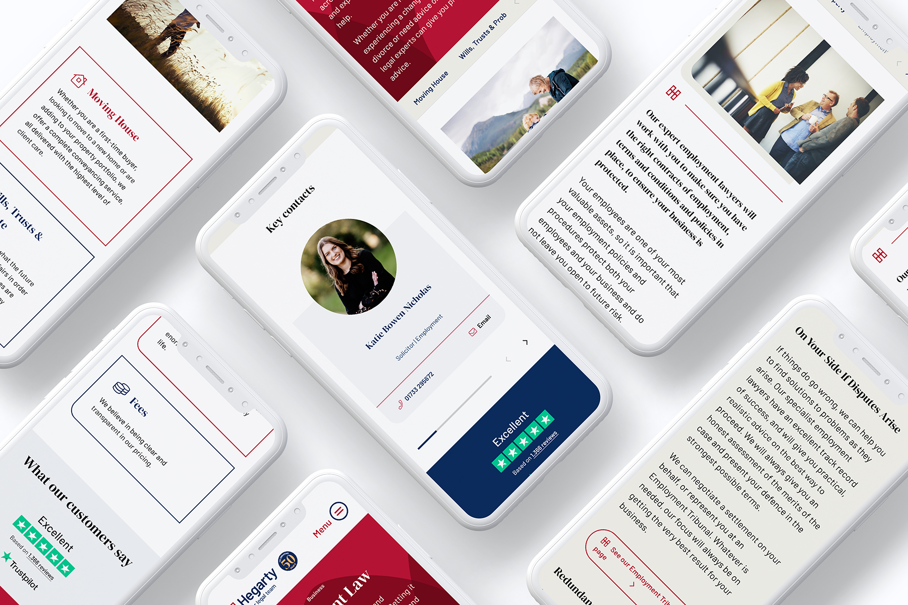
We developed a mobile-first design strategy and structure using a combination of take-over navigation paired with a sticky sub-navigation to keep the user flowing through the site quickly and effectively. The site needed to be a well-structured, easy-to-use website with clear signposting to service areas throughout.
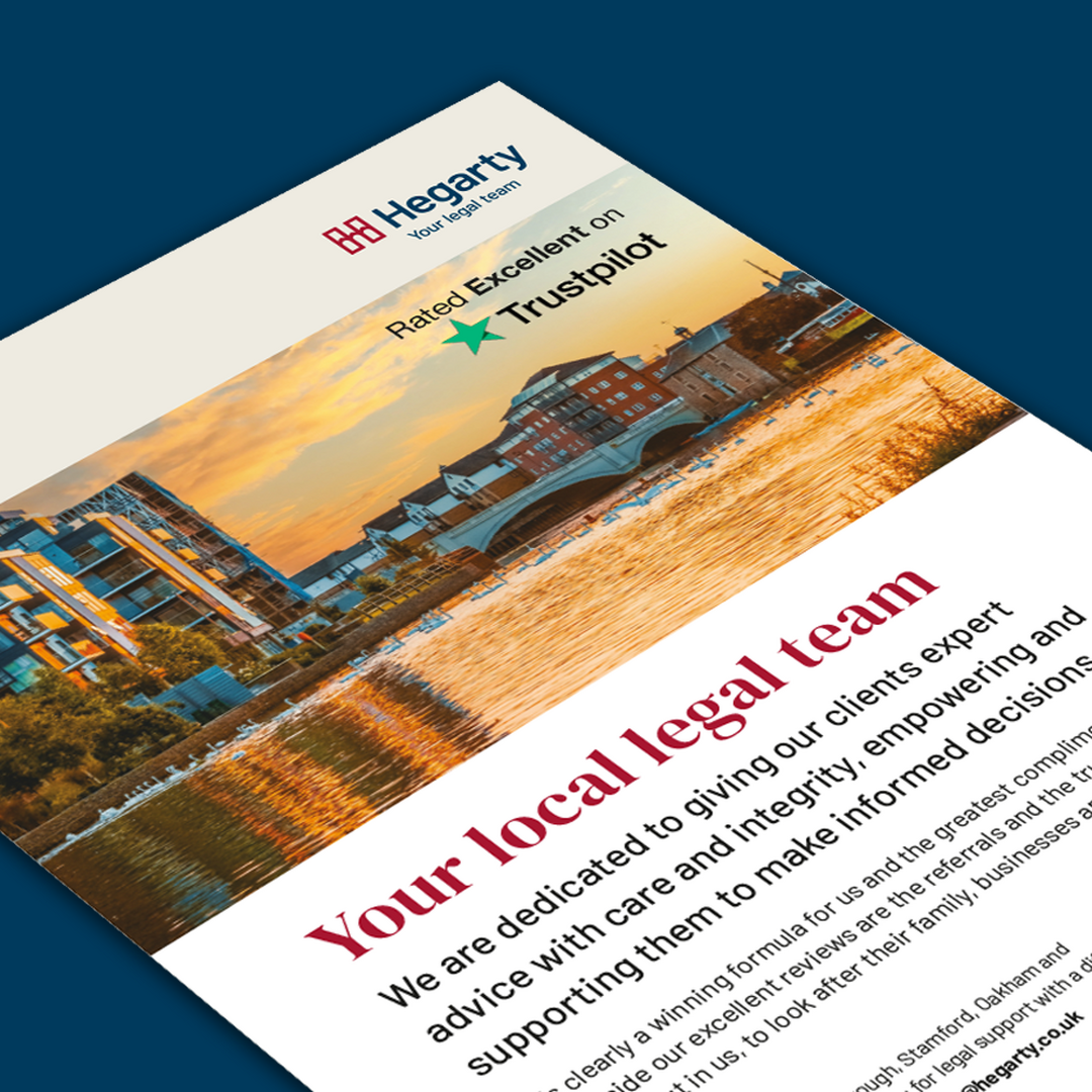
The key focus was for the site to demonstrate a friendly, approachable and transparent legal firm with all the information a client may need before enquiring. We incorporated local imagery to help resonate with local families and businesses that Hegarty provide services for.
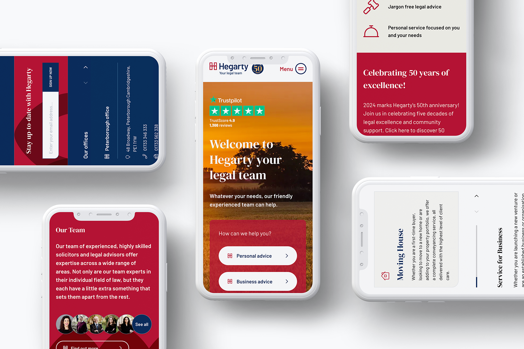
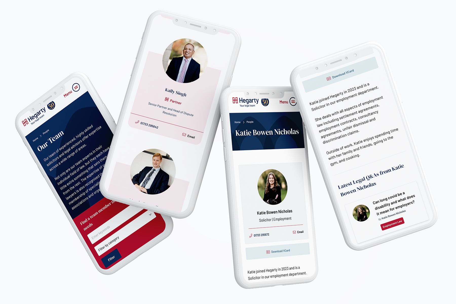
As with any legal company there is an unavoidable amount of information that is necessary but can be quite daunting. We were able to create digestible chunks for the user by harnessing the brand features and building different block types with them.
