Smart Home Charge

Project Overview
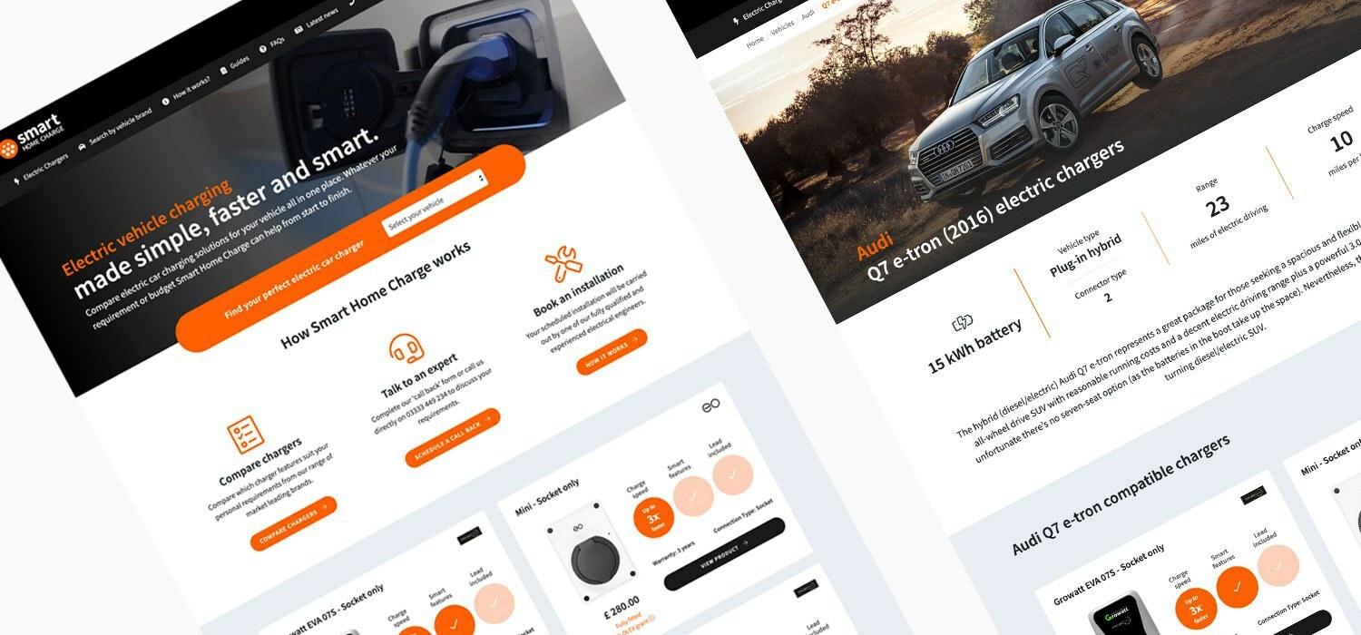
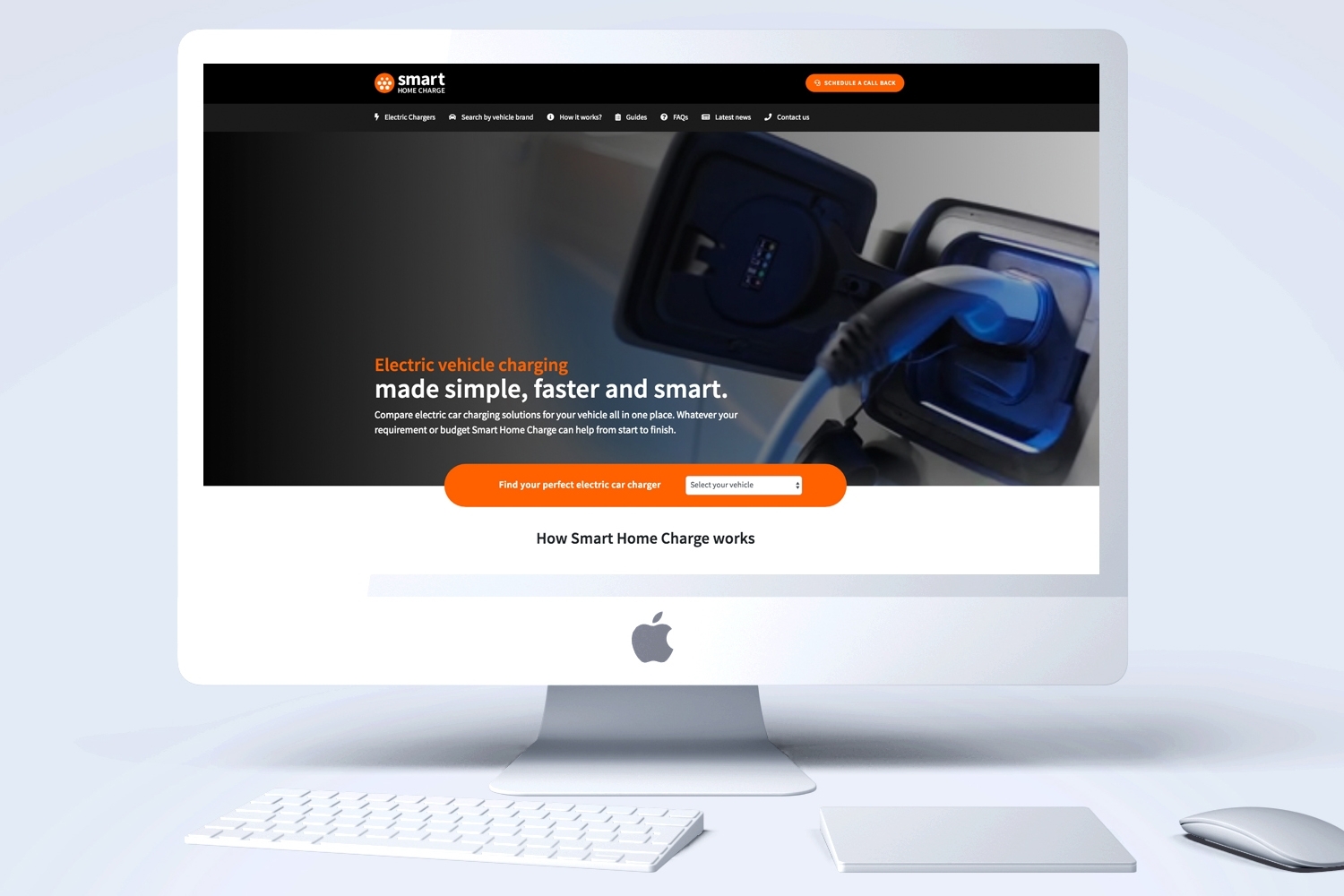
As an innovative new company in a quickly growing sector, Smart Home Charge tasked us to create a stand-out brand and an intuitive customer-centric website, making it easy for visitors to compare electric chargers suitable for their vehicle.
Creating a site which aligned their professional identity whilst delivering a simple, fast and smart process was the main aim for us.
Smart Home Charge Website
Our Process
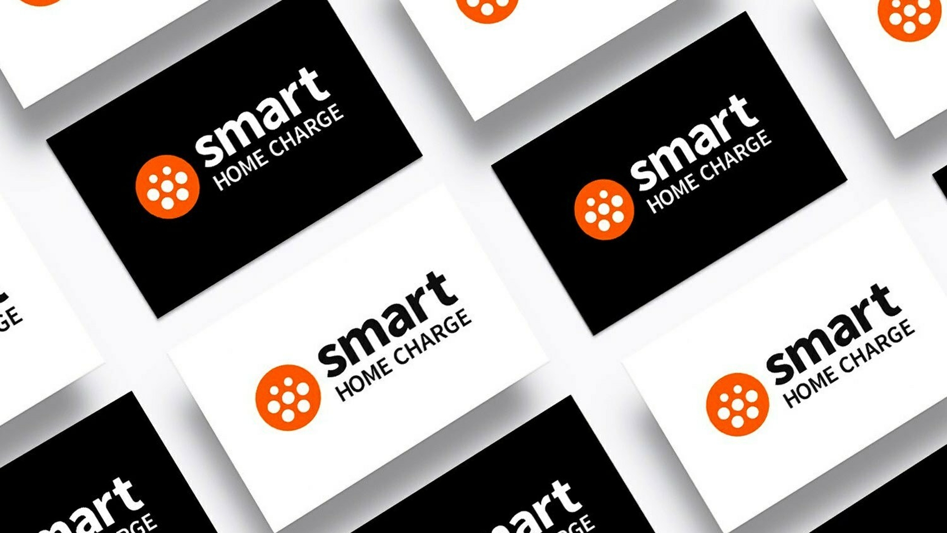
The first step for our creative team was to design a logo which stood out in the increasingly competitive electric car charger industry.
The slick logo design incorporates a charging plug, and multiple variations were created to give Smart Home Charge flexibility for use across digital platforms.
To promote the new brand and gain customer loyalty, we wanted to make sure that the website formed part of an omni-channel approach. From the research and planning, to the implementation, every aspect of the project was geared towards creating a seamless experience for the customer.
After extensive planning to map the user journey from the main navigation and ensure we maximised the SEO, we created unique landing pages for each make and model of cars. This ensured the customer could quickly find the best charger for their vehicle whilst giving the Smart Home Charge team an easy to manage format to keep the content up-to-date and relevant.

Impact
After launching the site, we continued to monitor the user experience utilising analytics and heat mapping software. This ensured we could make any crucial navigational tweaks to ensure the user’s flow was clear for the end goal.
Smart Home Charge instantly leveraged their brand exposure, and as a result gained new relationships with manufacturers that have since been included on the site. The Dsquared team have also received great feedback from charging manufacturers and the EV community.
We have continued to work on new developments to the site and advise on how to optimise its performance as the business grows and the strategy changes.
The site is now in the top 10% of performing websites for its high conversion rate.
