Responsive Logos
How to maximise your brand with a responsive logo
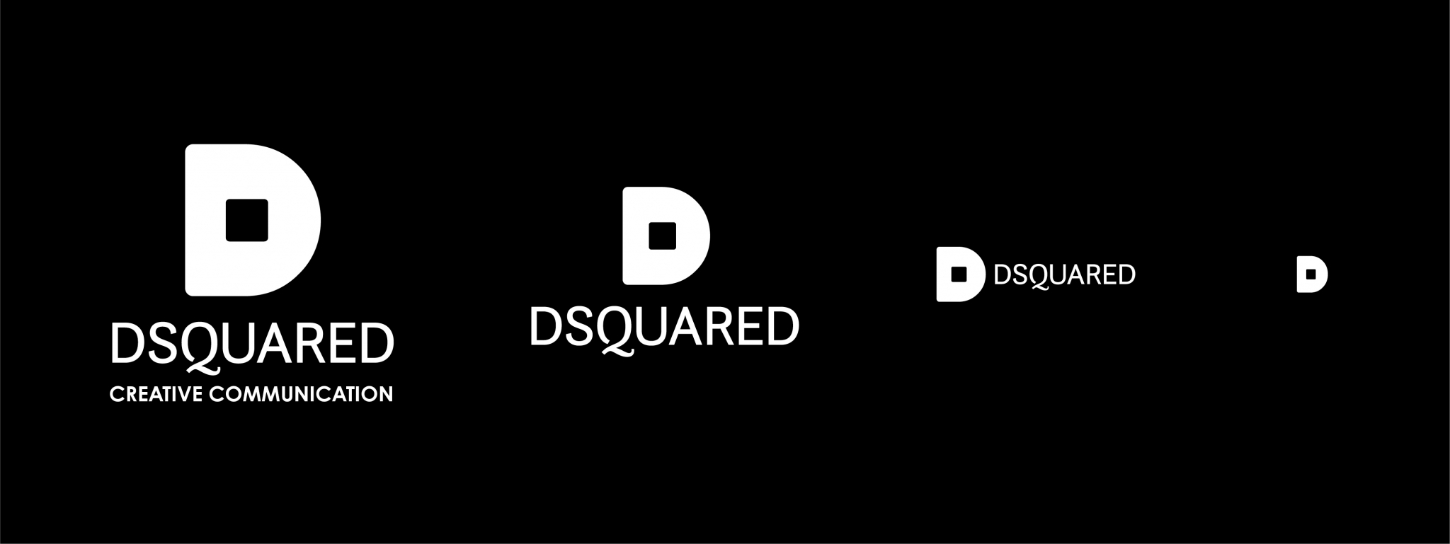
A responsive logo does what it says on the tin, it responds to where it’s placed. Instead of having just one version of your logo that is squeezed into small placements such as a Facebook profile picture, a responsive logo is shape-shifting – meaning it may change in size, complexity or even colour to adapt to different platforms.
What are the benefits of creating a responsive logo?
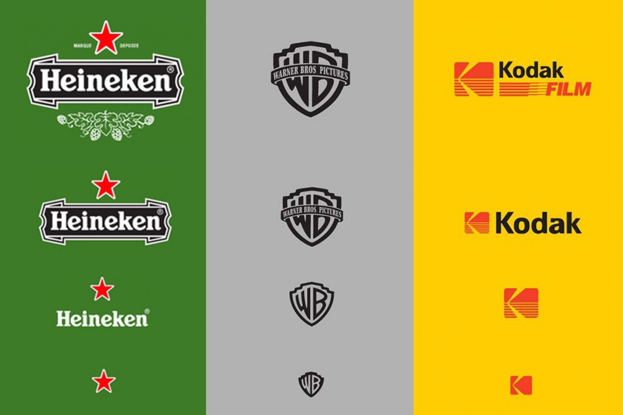
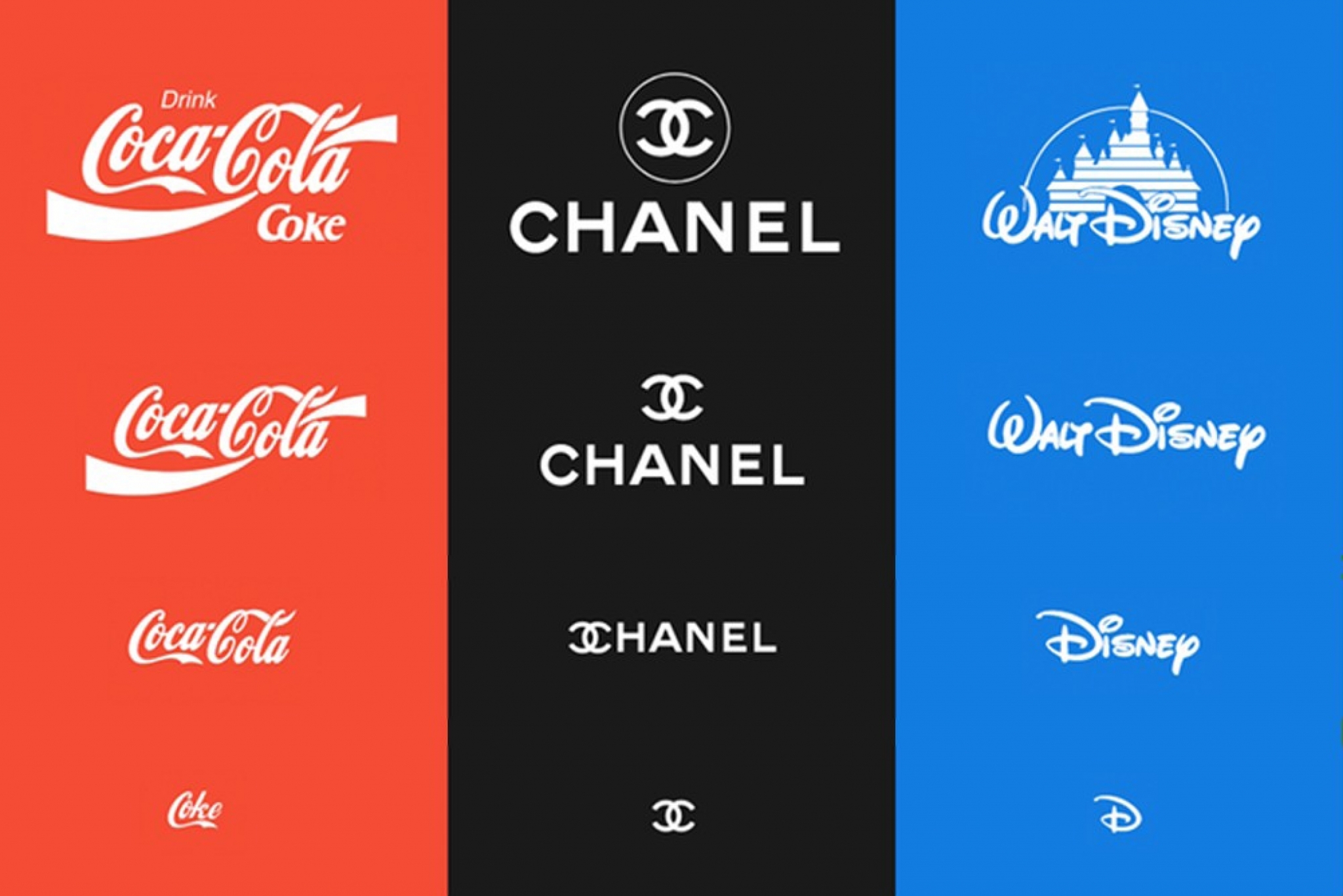
One of the most important benefits of a responsive logo is maximising legibility and making your brand instantly recognisable across all of your communication channels. A logo should be tailored to each size to create impact. It’s surprising how many brands you will know from a symbol alone as this aspect of their main logo has become synonymous with their identity.
If you are thinking about a rebrand or are looking at having a new logo created this is definitely a factor worth investing in from the onset, it will save you time and generate more enquiries in the long term. From brand launch, you need to create a lasting impression and having a logo that is illegible when scaled down is not going to help with this.
Having multiple versions of your logo will give you a variety of options for different situations whether it’s for printed brochures, email signatures, outdoor advertising, social media profiles, website or merchandise. The smaller a logo will be seen, the less elements should be kept. So, each version will be slightly more simplified without removing the main identifying element.
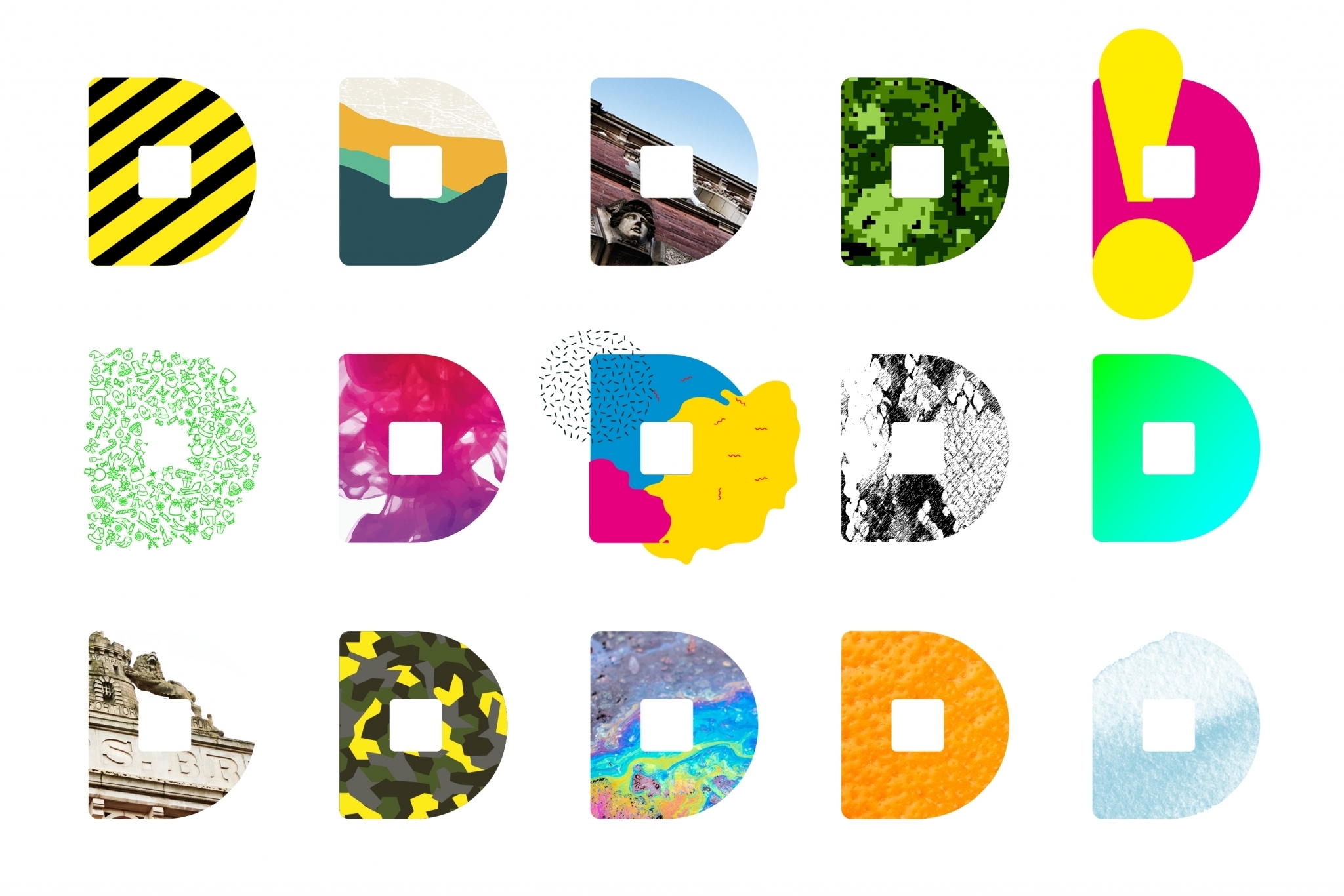
Next steps
At Dsquared, our team of designers will produce initial concepts and advise you on the most important elements of your logo to use in the creation of a fully responsive logo. We tailor our branding work to suit your needs whether it’s for a start-up business, a full rebrand or a new product launch.